Gephi Quick Start Guide
Gephi is an open-source network analysis and visualization software often used by researchers and professionals to explore and analyze complex networks. It's trendy among those working in social network analysis, biology, transportation, and more fields.
Gephi allows users to import network data, visualize it in various layouts, and apply different algorithms to analyze the structure and properties of the network. Users can also customize the appearance of nodes and edges, making it a powerful tool for creating visually appealing network visualizations.
This blog will cover a quick starter guide for Gephi. The official tutorial can be found in this link. Our version follows similar steps but in an updated version.
First, you need to download Gephi from this link and install it on your computer. This guide is done with the Gephi 0.10.1 version for Windows. The tutorial uses the LesMiserables sample dataset.
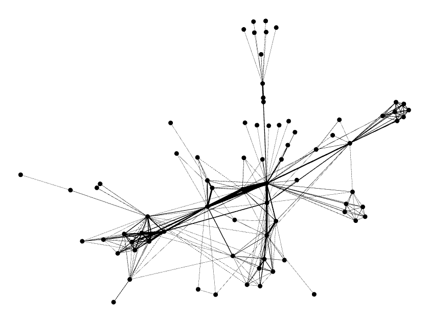
After starting Gephi, you need to import LesMiserables.gexf file. To do this go to File >> Open and choose the file. After opening it, you will see a graph like below. Just know that it might not look exactly the same since the nodes are positioned randomly at first:
Gephi has layout algorithms that set the graph shape. To reach it, find the Layout module, choose Force Atlas from the dropdown, and click on Run. You will encounter clustered nodes first. But go back to the Layout Properties tab where you can tweak the properties to your liking. For now, set the repulsion strength from default 200 to 10,000 to extend the graph. Then stop the algorithm. You will see a layouted graph:
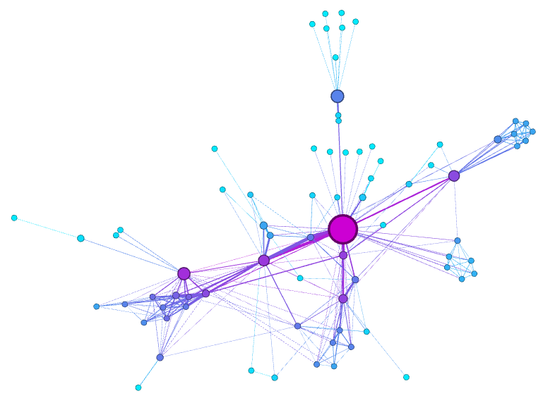
The Ranking module lets you configure nodes' color and size. For this, go to the Ranking module and choose Degree as a rank parameter, configure colors to your desire, and then apply.
You can see rank values by enabling the result table. This part is outdated in the official tutorial. What you need to do is open the Statistics panel from Window >> Statistics, and then run Average Degree. This will tell the degree of each node which can be seen in the Data Laboratory section. Looking here, Valjean is the most connected node in the network with 36 links.
While this graph looks nice, it still has some issues. One is that big nodes can overlap the smaller ones. This can be fixed by turning on the option Adjust by Sizes from the Layout panel. Do that and run again.
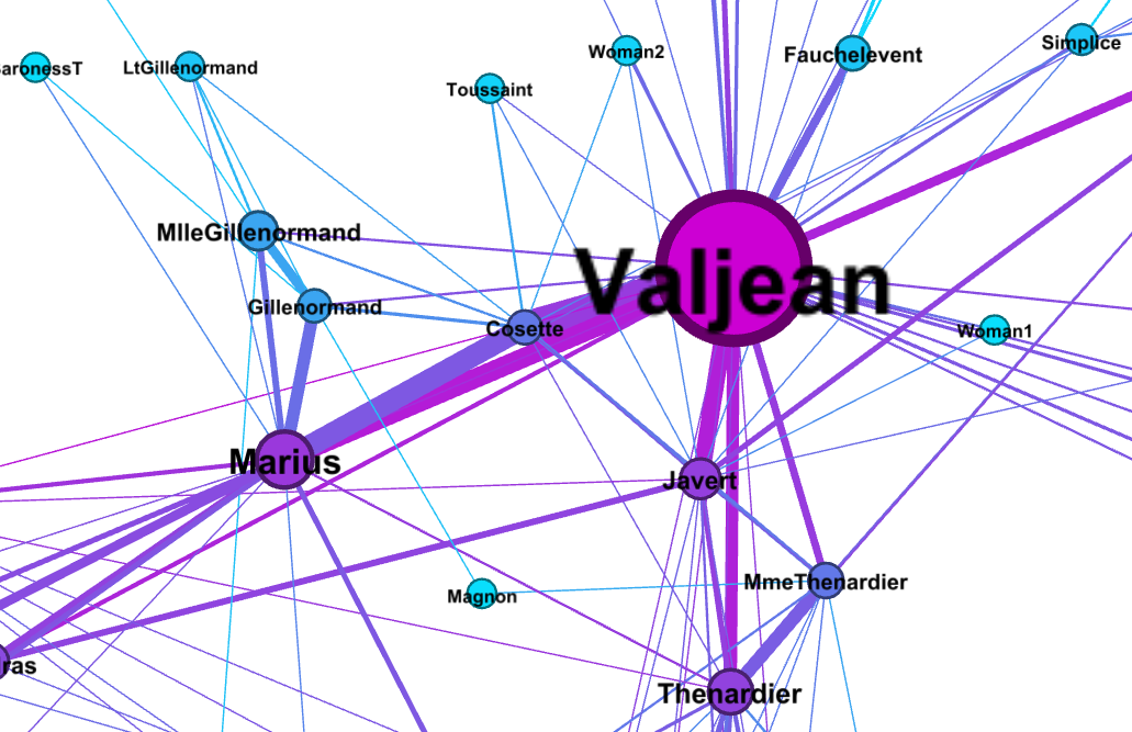
After that, you can click on Show Node Labels to see the labels of the nodes. There are also options to adjust their sizes either based on node size or just a fixed size. The image below shows the label scaled with node sizes.
There is also a way to detect and colorize the clusters. This can be useful to understand and study communities. For this go to the Statistics panel and run Modulatity. This uses a method called Louvain. When you do that, the nodes are attributed to different classes. To see this in effect, go to the Appearance panel and select Nodes >> Color >> Partition >> Modulatiry Class, select the colors and apply. This was also outdated in the official guide.
The last manipulation step is filtering. You can create filters that are used for hiding particular nodes and edges. We will create a filter to remove the leaf nodes. For this, go to the Filters panel, and select Topology >> Degree Range. A slider called Degree Range Settings will pop up. From there, set the lower bound to 2 and click on Filter. You will see that leaf nodes are hidden. Notice the blue ones.
Finally, you should export the graph as an SVG file. Click on Export SVG in the Preview window. You can export in PDF and PNG format as well. You can manipulate SVG files in Inkspace or Adobe Illustrator. If you haven't already done so, save your project in .gephi format.
And there you have it! Your very own visualized graph network.
Of course, there are many more ways to visualize your graph but that was all from me for now.
Thanks for reading!
Oğuz Arslan


Comments
Post a Comment